Sacrificed at the Alter of Liberal Feel-Good Policies

Here are some excerpts from an article by Walter Williams:

A very large percentage of all incoming freshmen have no business being admitted to college… the average combined SAT score for white students was 1576 out of a possible 2400. Black student SAT scores, at 1277, were the lowest of the seven reported racial groups. The College Board considers an SAT score of 1550 as the benchmark that indicates a readiness for college-level work. Only 32 percent of white students scored at or above proficient in math, and just 7 percent of black students did. Forty-six percent of white test takers scored proficient in reading, and 17 percent of blacks did. The ACT, another test used for admission to college, produced similar results… 34 percent of whites who took the ACT were deemed college-ready in all four areas – English, mathematics, reading and science. For blacks, it was only 6 percent.

The most pervasive form of racial discrimination at most colleges is affirmative action. In the name of helping people from groups that have suffered past discrimination, colleges admit black students whose academic preparation differs significantly with that of their white peers… As a result, students who might be successes in a less competitive environment are turned into failures. One faculty member at a historically black college put it this way: “The way we see it, the majority schools are wasting large numbers of good students. They have black students with admissions statistics (that are) very high, tops. But these students wind up majoring in sociology or recreation or get wiped out altogether.”

The academic elite feel righteous seeing blacks on campus, even if they are severely mismatched. Black people must ask: Are we going to sacrifice our youngsters so that white liberals can feel good about themselves?
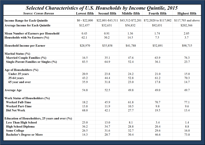
 

Income Inequality Argument Takes A(nother) Hit – Continued

True to his word, Mark Perry provided an update using the 2015 figures from the Census Bureau.  As Mark states toward the end of his article;

Bottom Line: Household demographics, including the average number of earners per household and the marital status, age, and education of householders are all very highly correlated with household income. Specifically, high-income households have a greater average number of income-earners than households in lower-income quintiles, and individuals in high income households are far more likely than individuals in low-income households to be well-educated, married, working full-time, and in their prime earning years. In contrast, individuals in lower-income households are far more likely than their counterparts in higher-income households to be less-educated, working part-time, either very young (under 35 years) or very old (over 65 years), and living in single-parent households.

The good news is that the key demographic factors that explain differences in household income are not fixed over our lifetimes and are largely under our control (e.g. staying in school and graduating, getting and staying married, etc.), which means that individuals and households are not destined to remain in a single income quintile forever. Fortunately, studies that track people over time indicate that individuals and households move up and down the income quintiles over their lifetimes, as the key demographic variables highlighted above change…

Speaking for myself, the first part of the next part is dead-on accurate.  Good Lord willing, the second half of the statement will be accurate, too.

It’s highly likely that most of today’s high-income, college-educated, married individuals who are now in their peak earning years were in a lower-income quintile in their prior, single, younger years, before they acquired education and job experience. It’s also likely that individuals in today’s top income quintiles will move back down to a lower income quintile in the future during their retirement years, which is just part of the natural lifetime cycle of moving up and down the income quintiles for most Americans.

income census bureau 2015.png

Professionals Push Back

From Seth Godin:

The architect refuses to design the big, ugly building that merely maximizes short term revenue. She understands that raising the average is part of her job.

The surgeon refuses to do needless surgery, no matter how much the client insists. He doesn’t confuse his oath with his income.

The marketer won’t help his client produce a spammy campaign filled with tricks and deceptions, because she knows that her career is the sum of her work.

The statesman won’t rush to embrace the bloodlust of the crowd, because statesmen govern in favor of our best instincts, not our worst ones.

There are plenty of people who will pander, race to the bottom and figure out how to, “give the public what it wants.” But that doesn’t have to be you. Professionals have standards. Professionals push back.

Twitter…

If you know me, you know I hate Twitter.  At its best, it’s an echo chamber, at its worst, it’s a sewer.  I was talking to someone last night and had this epiphany:

Twitter is to the 2010’s what leisure suits were to the 1970’s.  We know it’s not a good idea, but everyone else is doing it.  The vast majority of us are going to look back and think, “What the hell was I thinking?”


Income Inequality Argument Takes A(nother) Hit

Another chink in the income disparity arguments.  Mark Perry takes an article written by Thomas Sowell about how statistics can be misleading (you think?) and adds to it.

From Mr.Sowell:

When we hear about how much more income the top 20% of households make, compared to the bottom 20% of households, one key fact is usually left out. There are millions more people in the top 20% of households than in the bottom 20% of households.

The number of households is the same but the number of people in those households is very different. In 2002, there were 40 million people in the bottom 20% of households and 69 million people in the top 20%. A little over half of the households in the bottom 20% have nobody working. You don’t usually get a lot of income for doing nothing. In 2010, there were more people working full-time in the top 5% of households than in the bottom 20%.

Mr. Perry’s expanded take on this idea:

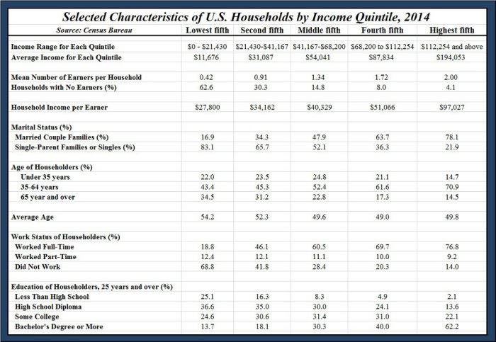
Income inequality between the highest and lowest quintiles shrinks considerably when it’s calculated on a per-earner basis. For example, in 2014, there was more than a 16X difference between the average income of households in the top 20% (about $194,000) and the average income of the bottom quintile households ($11,676), see table. But that difference shrinks to only a 3.5X difference between the average income per earner in the top 20% (about $97,000) and the average income per earner in the bottom 20% ($27,800). Therefore, when measured this way, about 80% of the income inequality between the top and bottom 20% of US households that generates so much attention and hand-wringing disappears just by adjusting for the number of earners per household.

Here is the graph to which they refer:

incomea2014

The False Promises of Obamacare

A great summation of the lies that were told (and the cover-up that is going on to hide those lies) can be found here.  Here is Mark Perry’s note at the end:

By now it should be crystal clear that the claims of “keep your doctor” and “keep your plan” were completely false, and that Obamacare was sold to the American people with lies that got the worst possible “Pants on Fire” rating from Politifact. Kudos to Jeryl Bier of The Weekly Standard for documenting how the Obamacare website has been gradually scrubbed of all references to the lies and false promises that allowed Obamacare to become reality.

A Voice of Reason

Part of a letter to incoming freshman from University of Chicago’s Dean of Students Jay Ellison:

“Our commitment to academic freedom means that we do not support so-called ‘trigger warnings,’ we do not cancel invited speakers because their topics might prove controversial, and we do not condone the creation of intellectual ‘safe spaces’ where individuals can retreat from ideas and perspectives at odds with their own.”

From the Chicago Marron

A Non-Profit Organization That Spends 6 Percent of Its Donations on Actual Programs?!?!

From National Review:

It is important to keep in mind what the Clinton Foundation mainly does: It does precious little in the way of actual philanthropy ($9 million worth out of $140 million in revenue for 2013) but instead spends almost all of its money on salaries and travel expenses for various Clintons (including Chelsea Clinton, now its vice chairman), Democratic allies, toadies, flunkies, hangers-on, and assorted minions.